Control the Plotting Order in ggplot2
06 May 2015
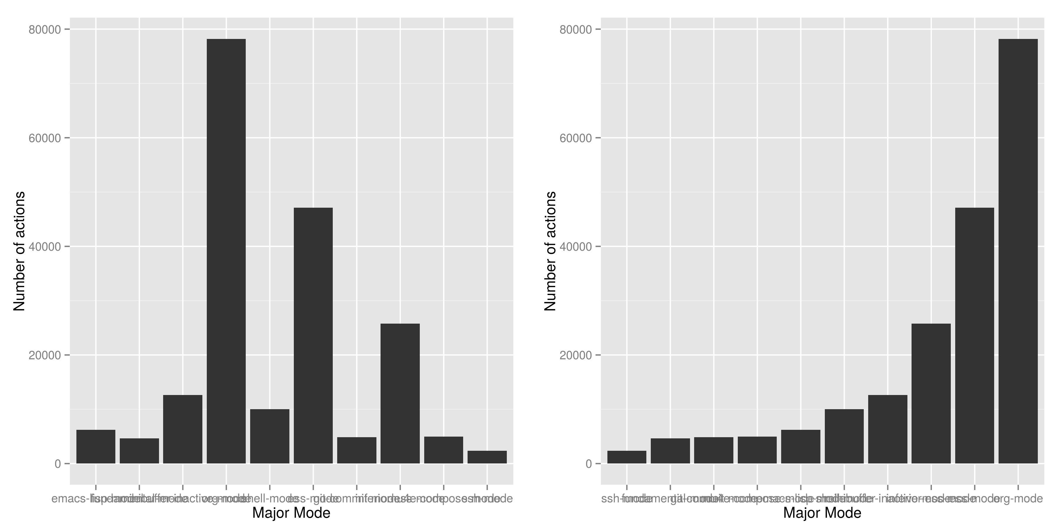
The above two plots show the same data (included below), and if you are going to present one to summarise your findings, which will you choose? It is very likely you are going to pick the right one, because
- the linear increasing feature of bars is pleasant to see,
- it is easier to compare the categories, the ones on the right has higher value than the ones on the left, and
- categories with lowest and highest value are clearly shown,
In this article I am trying to explain how to specify the plotting orders in ggplot to whatever you want and encourage R starters to use ggplot2.
To create a bar plot is dead easy in R, take this dataset as an example,
| mode | count |
|---|---|
| ssh-mode | 2361 |
| fundamental-mode | 4626 |
| git-commit-mode | 4869 |
| mu4e-compose-mode | 4964 |
| emacs-lisp-mode | 6205 |
| shell-mode | 10046 |
| minibuffer-inactive-mode | 12624 |
| inferior-ess-mode | 25774 |
| ess-mode | 47115 |
| org-mode | 78195 |
to get the plot on the right side, reorder the table by count (it is already been done), then
with(df, barplot(count, names.arg = mode))
will do the job. That's simple and easy, it does what you provide. This is completely different to ggplot() paradigm, which does a lot computation behind the scene.
ggplot(df, aes(mode, count)) + geom_bar()will give you the first plot; the categories are in alphabetically order. In order to get a pleasant increasing order that depends on the count or any other variable, or even manually specified order, you have to explicitly change the level of factors.
df$mode.ordered <- factor(df$mode, levels = df$mode)create another variable mode.oredered which looks the same as mode, except for the underlying levels are in different. It is set to the order of counts. Run the same ggplot code again will give you the plot on the right. How does it work?
First, every factor in R is mapped into an integer, and the default mapping algorithm is
- sort the factor vector alphabetically,
- map the first factor to 1, and last to 10.
So emacs-lisp-mode is mapped to 1 and ssh-mode is mapped to 10.
What the reorder script can do is to sort the factors by count, so that ssh-mode is mapped to 1 and org-mode is mapped to 10, I.e. the factor order which are set to the order of count.
How does this affects ggplot? I presume ggplot do the plotting on the order of levels, or let's say on the integer space, I.e. do the plotting from 1 to 10, and then add the labels for each.
In this example, the default barplot function did the job. Usually we need to do extra data manipulation so that ggplot will do what we want, in exchange for the plot good better and may fits in the other plots. Without considering the time constraints, I would encourage people to stick with ggplot because like many other things in life, once you understand, it becomes easier to do. For example, it is actually very easy to specify the order manually with only two steps:
- first, sort the whole data.frame to a variable,
- then change the
levelsoptions infactor()to what ever you want.
To show a decreasing trends - the reverse order of increasing, just use levels = rev(mode). How neat!